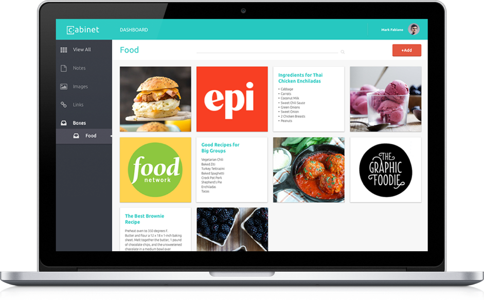
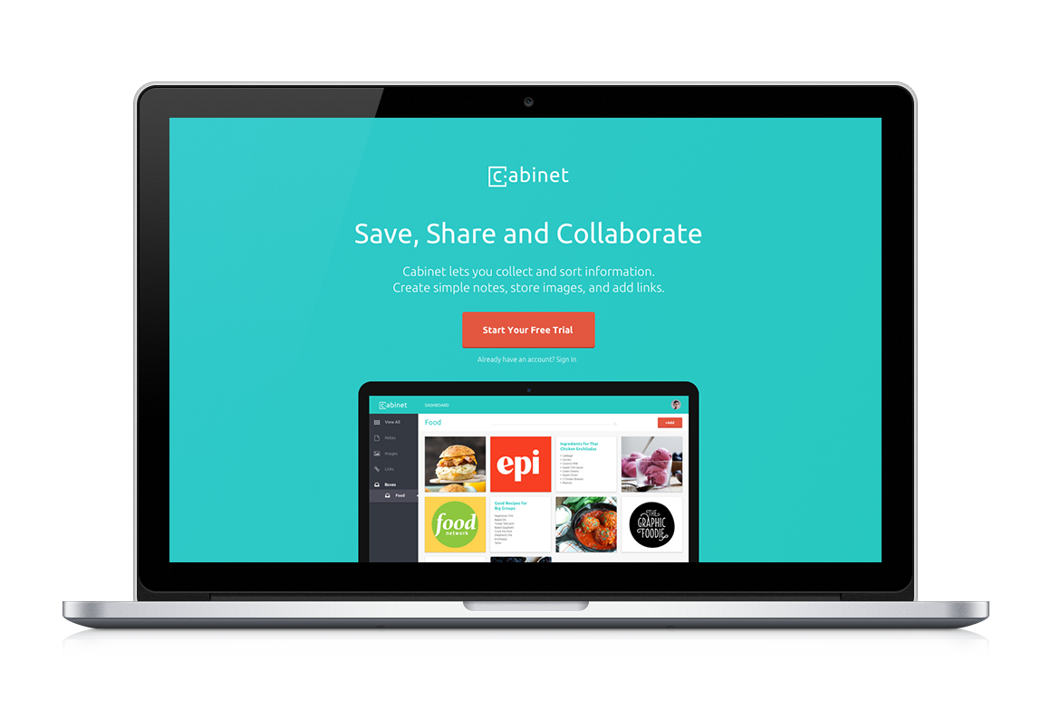
UI/UX Design

Cabinet

web application for saving and sorting online content

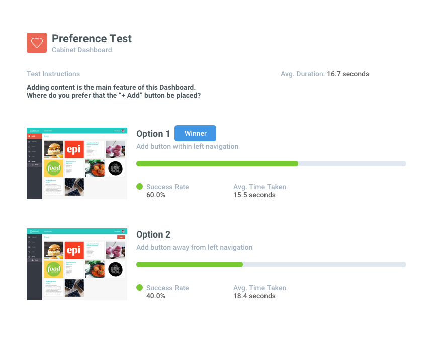
Idea generation, UX documentation, user research, wireframing, UI design, promotional site prototype, user testing

down-arrow
The Challenge

Save, Sort & Share Everything

With so many apps out there for saving content - Evernote, Pinterest, Dragdis, Pocket- it can be difficult to know which product to choose. Many of these apps do a good job of saving only one type of content, like just images or just articles. None of them, however, do an excellent job of saving a variety of content in a visually appealing way. Cabinet allows users to save a variety of content - websites, images and text documents all in one place. Users can file this content into different project folders that they can then share with collaborators. It is the perfect solution for visual users to organize everything they find on the internet.
Research + Discovery

Content Keepers

To form a better understanding of users' online habits, I conducted some user research. I created and distributed a survey that asked participants about the various ways that they save and create content online. Using the data from this survey, I made a plan for how the app should be structured and created a list of features that users would like to have. I also created five personas based on the research and various benefits and pain points that were gathered.
Benefits
Pain Points
  • Organize into notebooks
  • Easy Accessibility
  • Sharing features
  • Drag & Drop
  • Replace big notebooks
  • Sync across all devices
  • Slick interfaces
  • Filter content by type
  • One click
  • Saving content for later
  • Disorganization
  • Trouble finding things
  • Losing Content
  • Misplacing notes
  • Unsorted content
  • Feeling overwhelmed
  • Privacy concerns
  • Clunky interfaces
  • Bad search function
  • Downloading content

Terrence

Age: 36
Location: San Francisco, CA
"Inspiration Collector & Sharer"

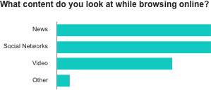
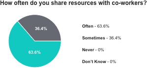
Terrence has worked at the same creative firm for 7 years now. He is constantly scouring the internet for inspiration. He needs a well-organized and visually-appealing way to store reference images and articles. He often shares these things with his team to inspire or educate them on some aspect of design.

User Flows

To explore how users would navigate around the site, I created flows for different scenarios including when new users visit the homepage or sign up, when returning users sign in, and when all users access the dashboard. These exercises are helpful in figuring out faster ways for users to accomplish their goals. Below is Terrence's flow to send an image to a teammate.
Structure + Wireframes

The User Experience

The user flows helped with the creation of the sitemap and with the layout sketches for each page as well. I explored how users would browse the homepage, signup for service, add and edit content on their dashboard and change account settings. I created wireframes in Sketch and then uploaded them to Invision to conduct usability tests.
cabinet site design
Product Page

Promoting the App

Cabinet's product page promotes the app's features, pricing structure and provides a few user reviews for social proof. Red buttons drive the user to sign up for the service multiple times throughout the design.
cabinet product page

User Testing

I ran a variety of tests on both the dashboard and the promotion page using a combination of Invision, UsabilityHub and Peek by UserTesting. I received some positive feedback from testers including that they found the site trustworthy as well as valuable. One test looked at user preference for the location of the add button since it is one of the most important features of the dashboard. Based on the feeback I recieved, I moved the button from the top right corner to within the side navigation on the left.
preference test